P R O J E C T
Le Belle Radici
C L I E N T
Adolfo
D I S C I P L I N E
Branding / Digital Illustration /
Typography / Print Design
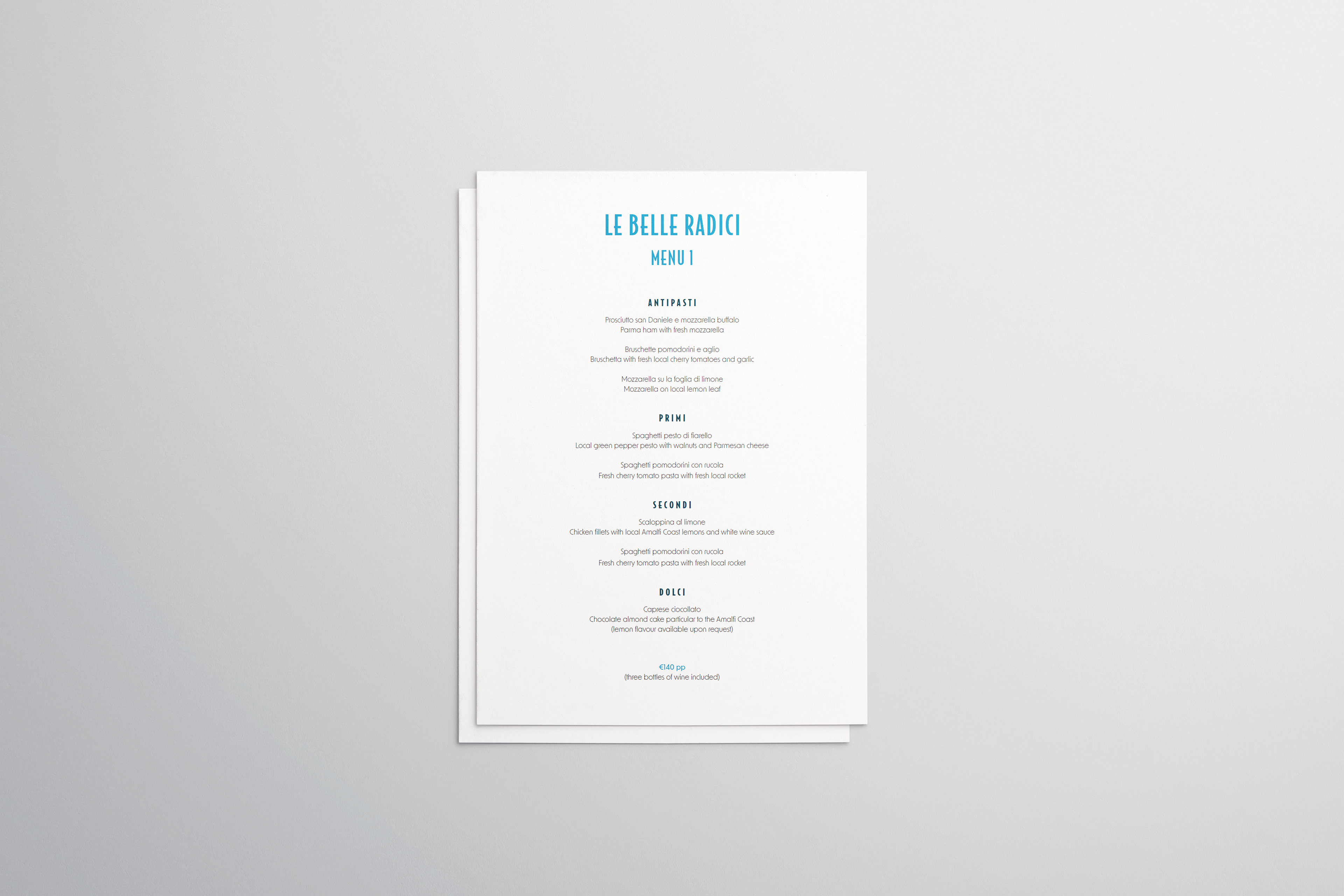
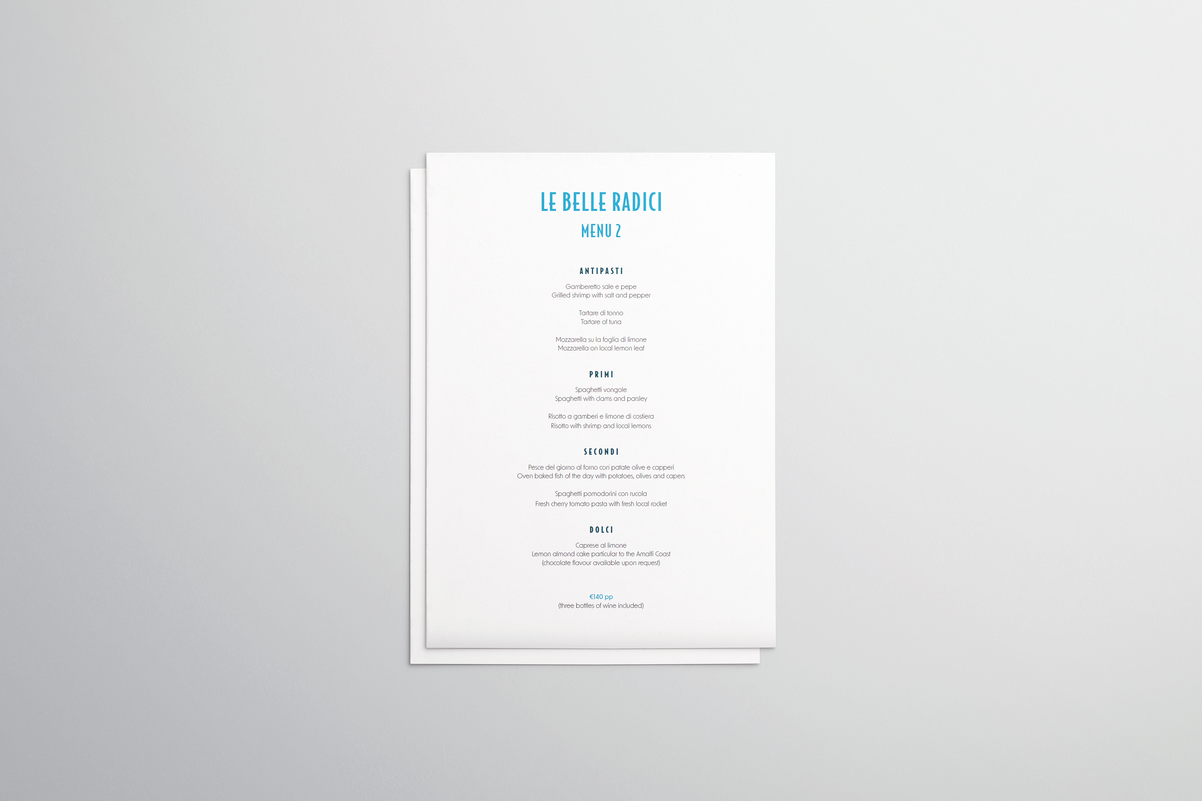
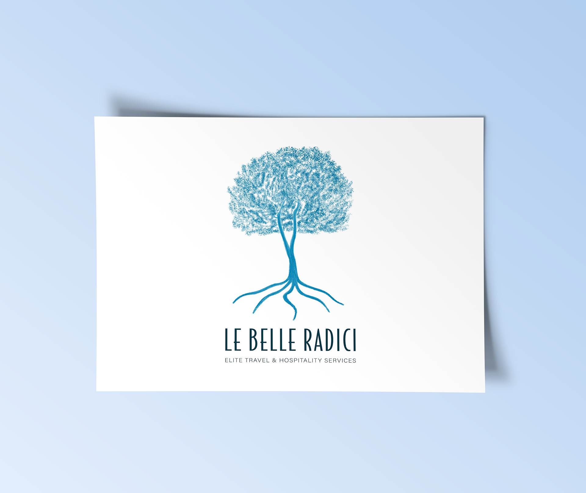
Le Belle Radici is a project I worked on for a client starting a private dining and elite travel business in his hometown of Positano, Italy.
He chose the name 'Le Belle Radici' as it means 'beautiful roots' in Italian and he wanted the logo to relate to his ancestors and the family he has in Positano. It was important to us to ensure this was portrayed in both the imagery and the typography.
With this in mind, I created the tree and based it off the Italian Pine tree that sits in the backyard of his family home to symbolise this connection. The typography was also very important as he wanted a typeface that was similar to the other businesses in the area so that it was cohesive and matched the Positano vibe. However, he also wanted it to be different and stand out against the others while remaining clean and simple. With a lot of research and experimentation, I found the perfect typeface that contrasted well with the tree and the client was incredibly happy.